Context
A configurator working against its users
The Build and Price tool sits at one of the most consequential moments in Kia’s digital funnel: the point where a shopper moves from browsing to seriously considering a purchase. Get them through it, and they connect with a dealer. Lose them, and they leave without a lead.
The tool had a completion problem. Users were abandoning mid configuration, and the prevailing diagnosis was a cluttered interface. The proposed fix was visual cleanup. I believed the problem ran deeper than that.
The Real Problem
The X marks were the symptom. The architecture was the disease.
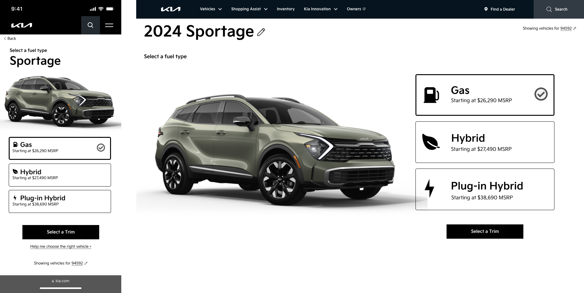
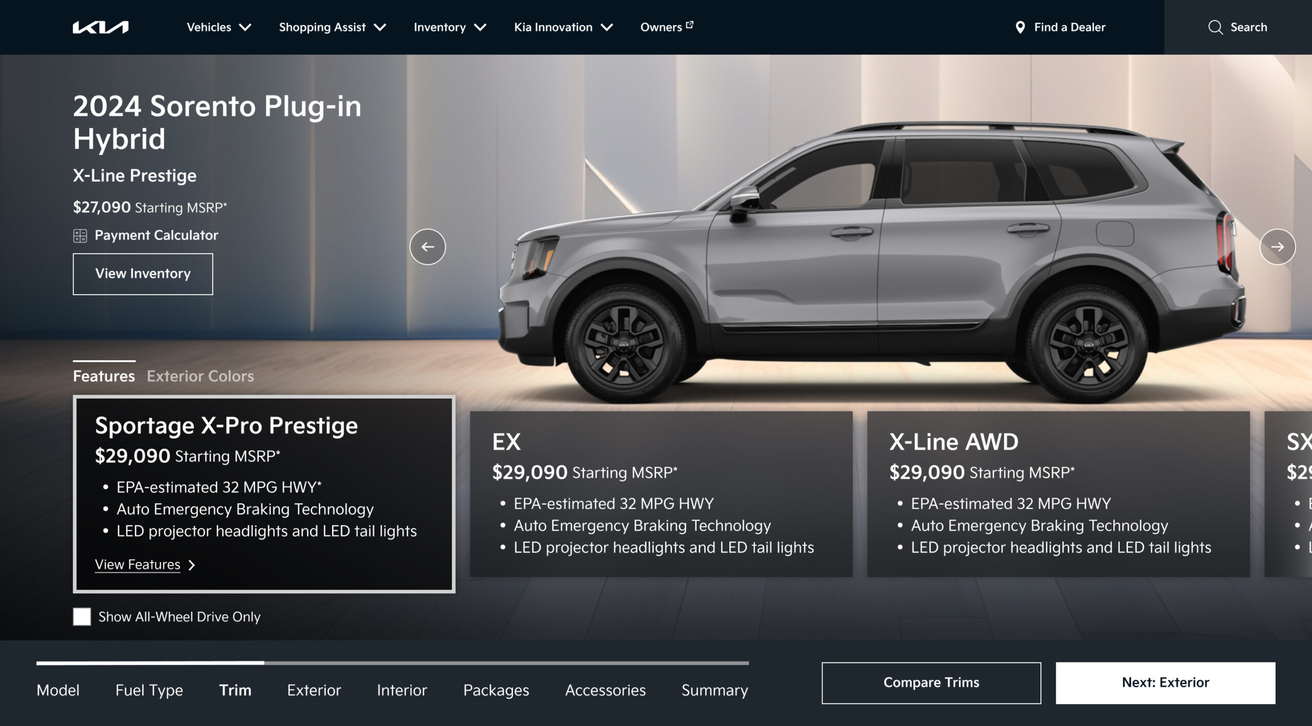
Looking at the existing tool, everything was presented at once: trim selection at the bottom, exterior and interior color tabs side by side, a 360 viewer showing a car that had nothing to do with what you were configuring. Users were making decisions in the wrong order, with no understanding of how those decisions constrained each other.
The X marks on the color swatches told the real story. They weren’t a design detail to clean up — they were evidence that users were regularly reaching the color selection step having already made a trim choice that silently eliminated most of their preferred options. By the time they hit that wall, they’d invested enough time that the frustration was abandonment level.
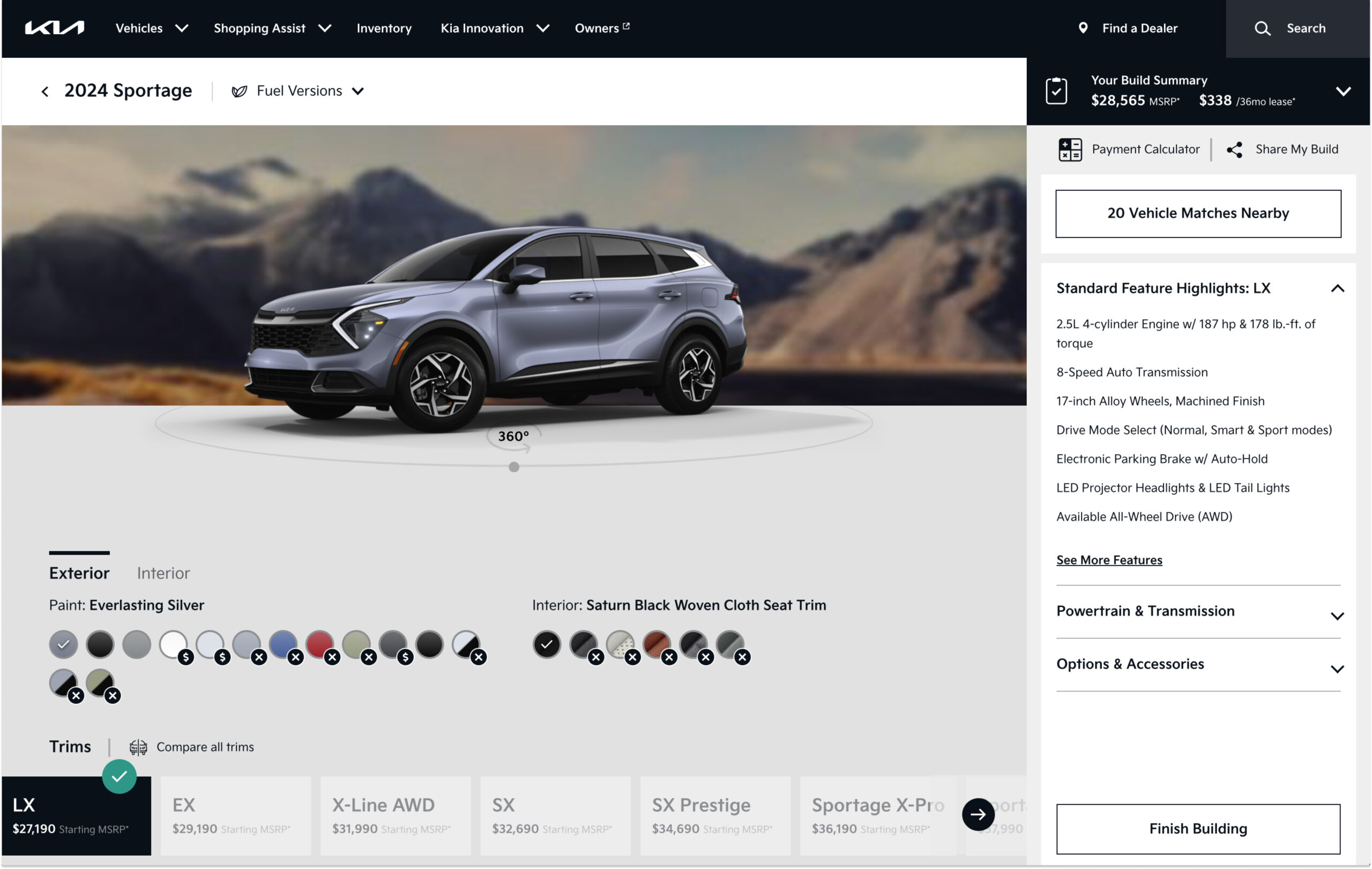
"I picked my color and then found out it wasn’t available for the trim I wanted. I just gave up."
Usability study participant, 2022This wasn’t a layout problem. It was an information architecture problem. The tool presented all decisions simultaneously without accounting for the fact that earlier decisions should constrain later ones. The fix wasn’t to make it look cleaner, it was to change the order of operations entirely.
The Reframe
Don’t show all options. Show the right options.
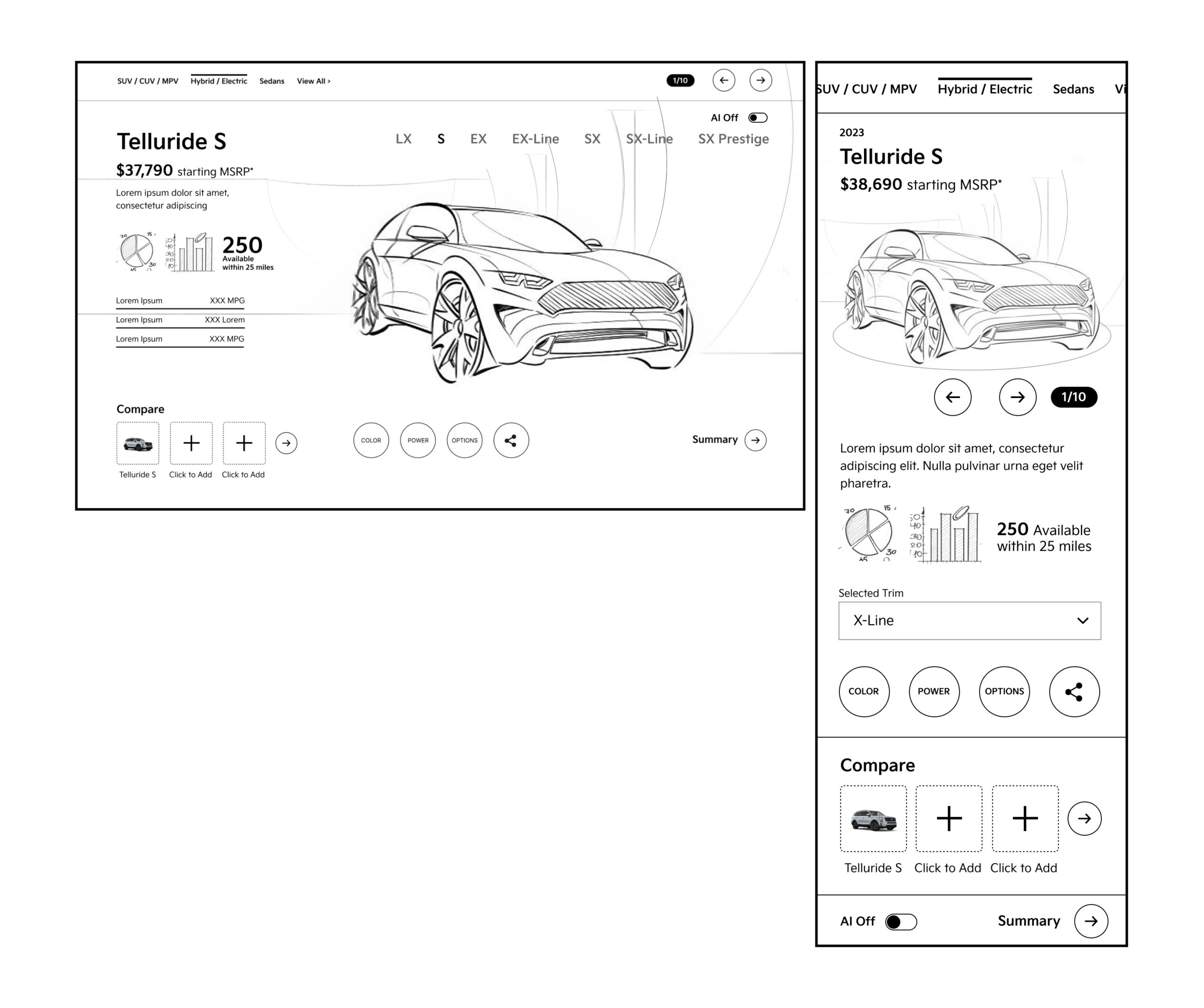
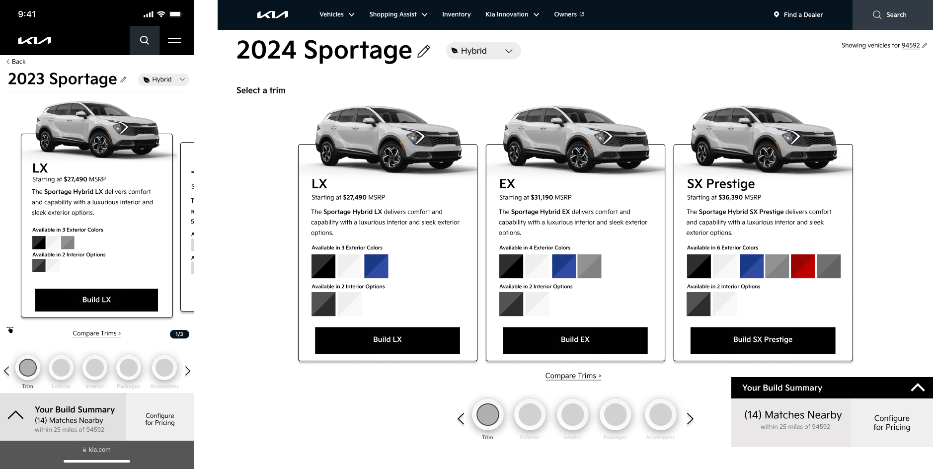
The insight that drove the redesign was simple: if you scope what users can select based on what they’ve already chosen, conflicts become impossible. A sequential flow that orders decisions by dependency, trim first, then exterior color, then interior, means every option presented at each step is a valid one. The X marks disappear not because we hid them, but because they can no longer exist.
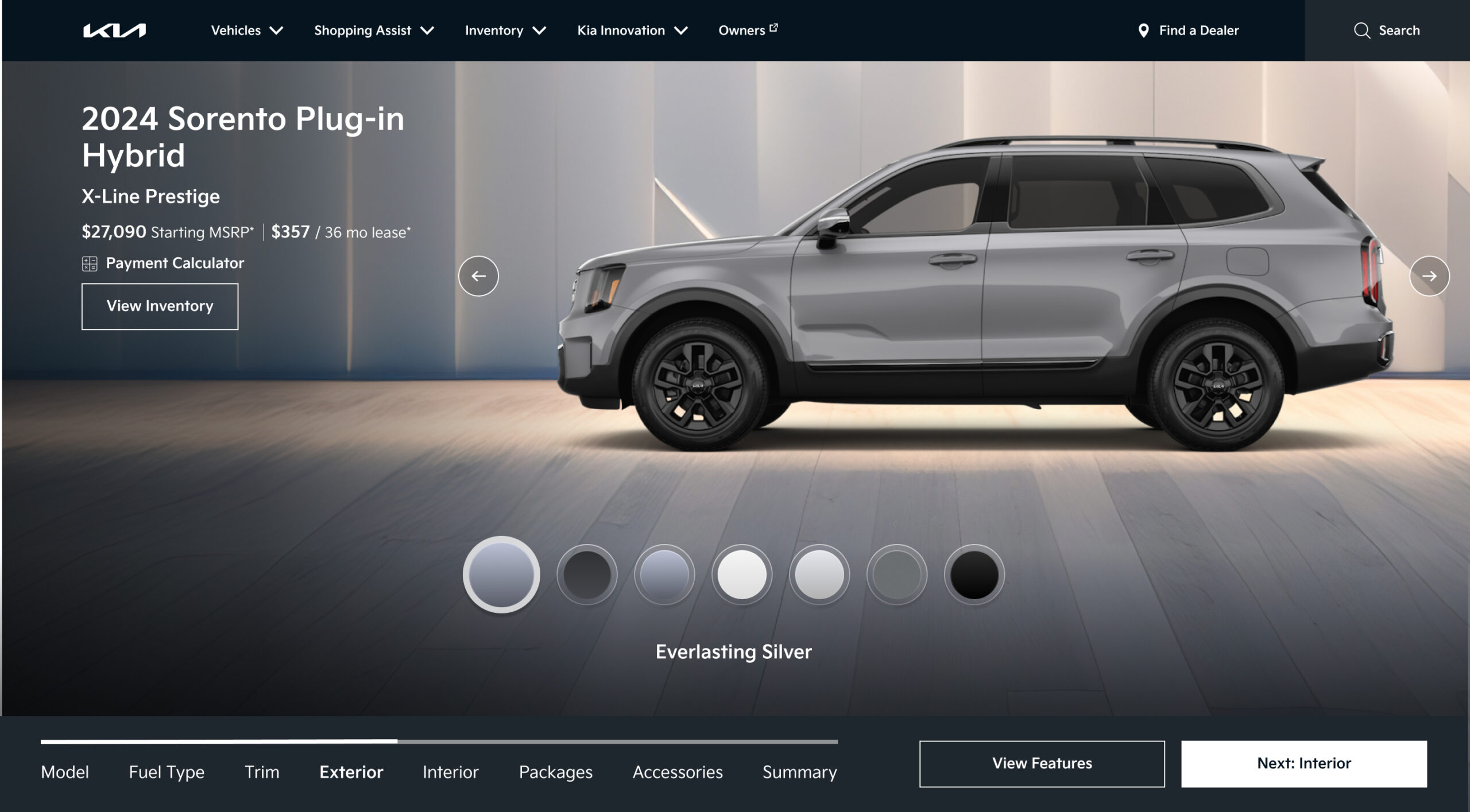
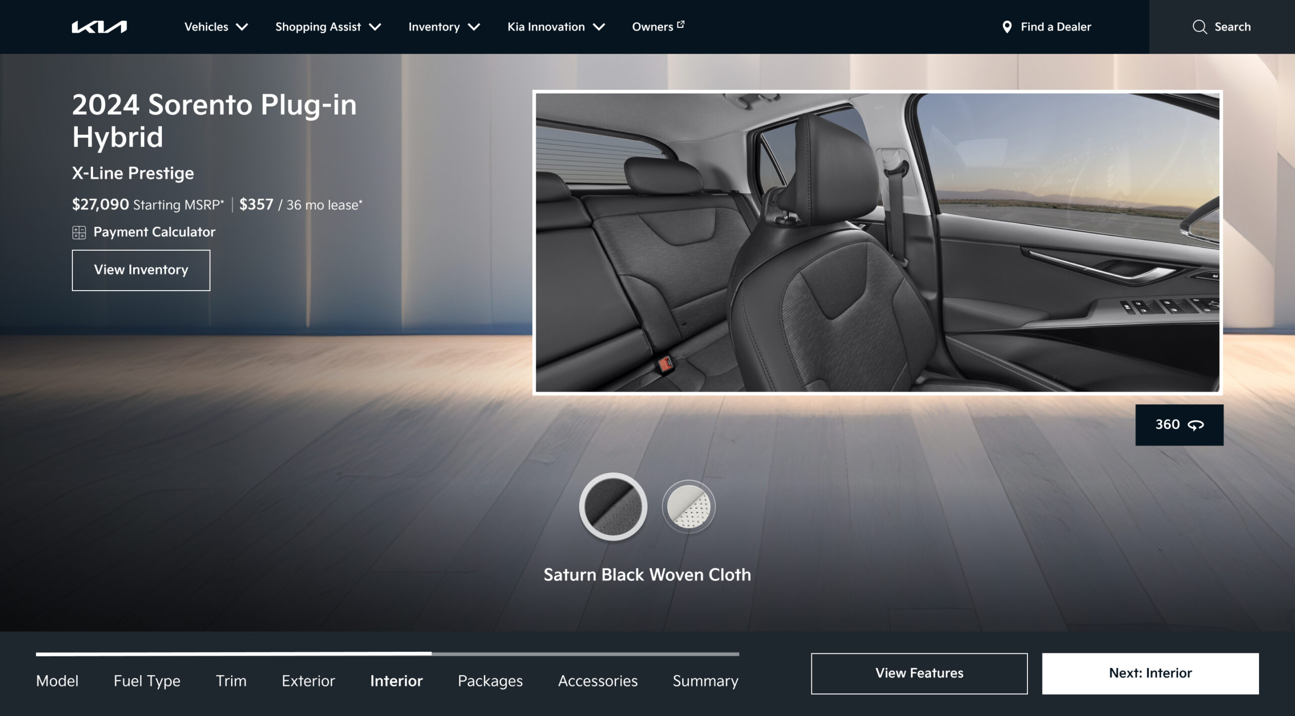
The second piece was the visualization. The existing 360 viewer was a standalone feature, completely disconnected from the configuration state. I pushed to connect them: if the vehicle image updates live as the user makes each selection, the car they see is always the car they’re building. That feedback loop builds confidence — users can see the consequences of each choice in real time, which means they arrive at the end of the flow with conviction rather than uncertainty.
A sequential step flow eliminates color conflicts because options are scoped to prior selections. It also creates the ideal condition for live visualization: each step has a single clear decision, which means the vehicle image always has an unambiguous state to reflect. The two features were designed together because they only work together.
Concept & Validation
Selling the vision before building it
A structural rethink of this scale required alignment before a single high fidelity frame was produced. I developed a detailed interaction model documenting every step state, dependency rule, conflict prevention pattern, and transition — giving the client and engineering team a concrete picture of what we were proposing and why it would work.
Two rounds of moderated usability testing confirmed the hypothesis: scoping options by dependency reduced abandonment and increased completion. Users completed configurations faster, reported less confusion, and reached the dealer CTA at a meaningfully higher rate than the control. The sequential model was approved for full production.
Execution
Staying close to the craft
Setting the direction was one part of the job. Seeing it through to a shippable product was the other. I stayed in the work throughout the six month build, authoring the interaction specification covering 140 plus states, transitions, and edge cases, and running design reviews with engineering biweekly to maintain fidelity to the approved direction.
The most demanding problem was the constraint system itself. Surfacing which options were unavailable and why — without creating confusion or dead ends — required careful decisions about state visibility, messaging tone, and the logic for offering the nearest valid alternative.
The Solution
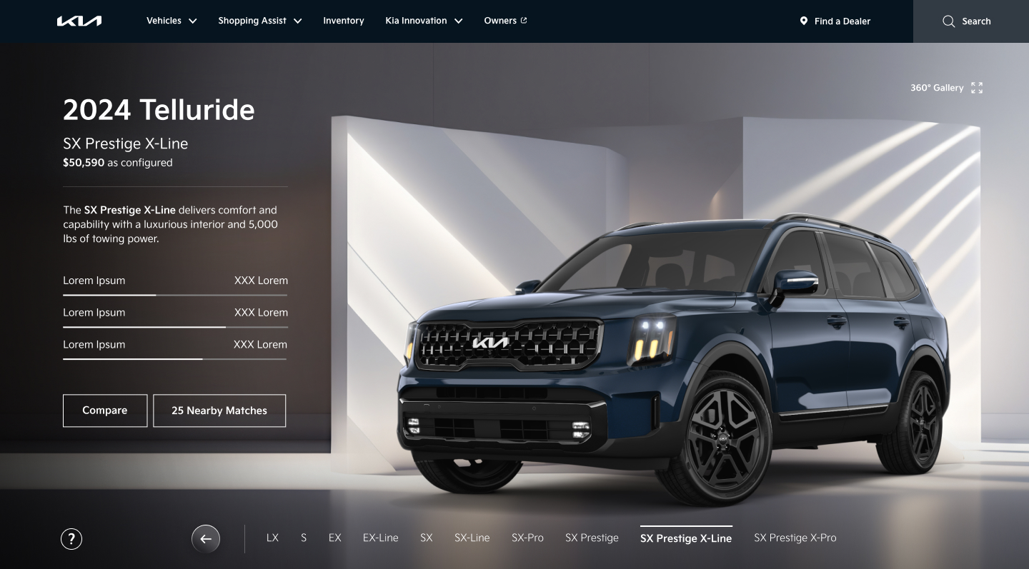
The car you see is the car you’re building
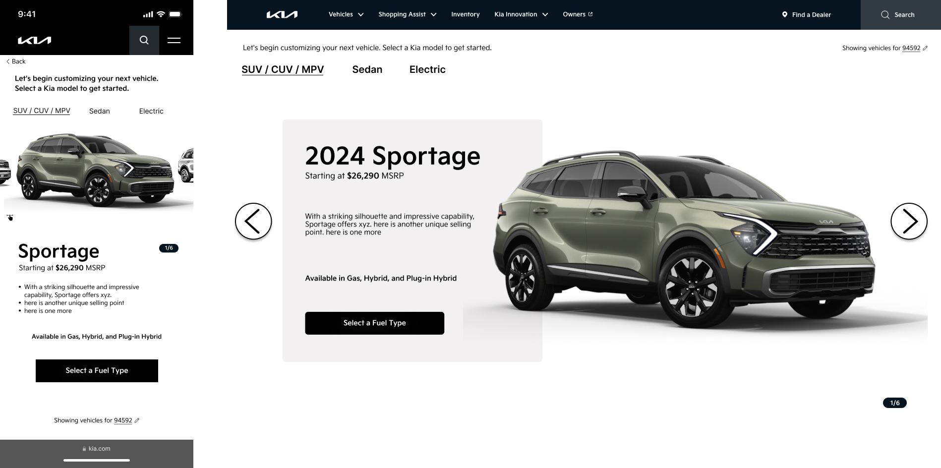
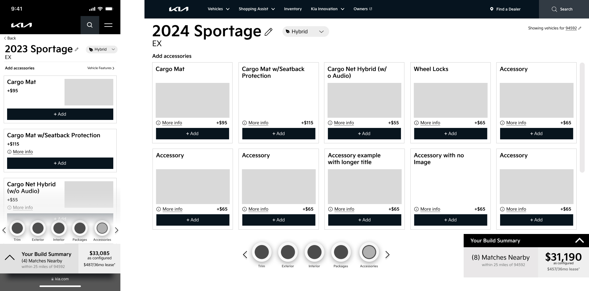
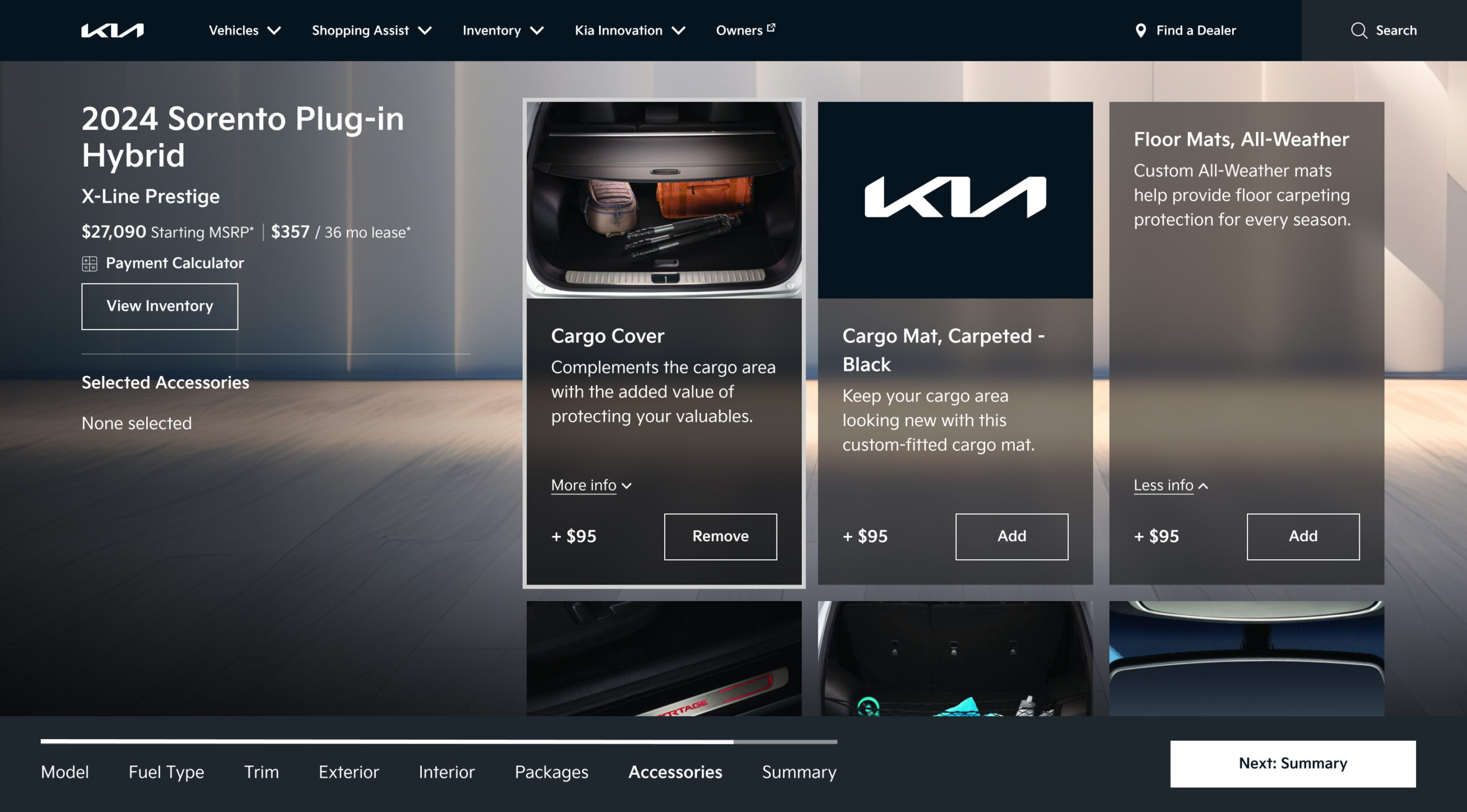
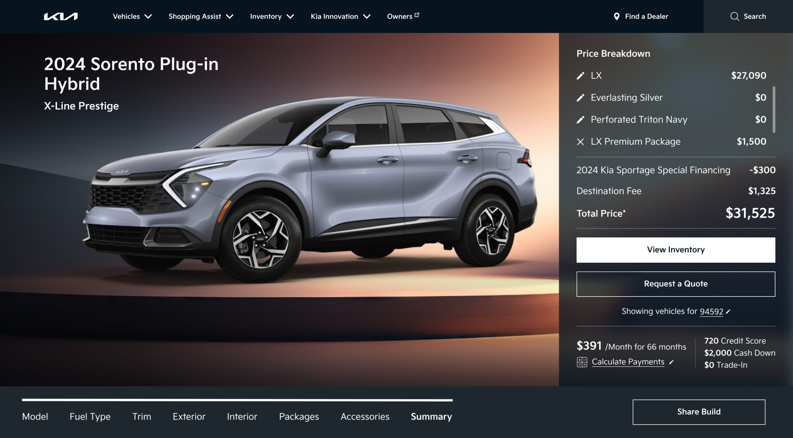
The final experience centers on a persistent vehicle visualization panel that updates live with every selection. On desktop, the vehicle occupies the right half of the screen while configuration steps progress on the left. Each step presents only valid options based on prior selections, so users never encounter an unavailable choice. The running price summary is visible throughout.
On mobile, the visualization anchors the top of the viewport as a sticky image that updates with each selection, while step options scroll below. The flow ends with a dealer connection step that captures intent at the natural conclusion of the build.
Impact
What the numbers said
Following launch, the redesigned configurator delivered two headline results: a +17% lift in Build & Price completion rates and 14x more user engagement compared to the previous experience. Both numbers trace directly back to the structural fix, not to cosmetic changes or repositioned CTAs.
When users no longer hit dead ends from color and trim conflicts, they finished what they started. And when the car they saw was always the car they were building, they stayed engaged throughout the flow rather than dropping off mid configuration.
The redesign became the reference model for Kia America’s configurator UX across additional vehicle lines. The dependency scoped step flow and live visualization were adopted as the standard pattern, extending the impact of the original design system investment beyond the initial launch.
Prototype Walkthrough
See it in motion
The walkthrough below demonstrates the full configuration flow from trim selection through to the dealer connection step, including the live visualization update and the mobile experience.